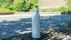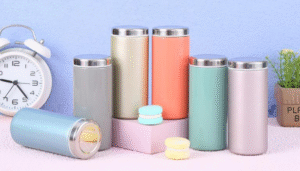
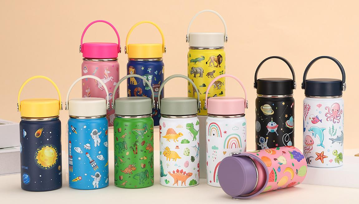
1. Классификация и характеристики основных цветовых схем
Имеющиеся в продаже термосы в основном разделены на три цветовые серии.: цвет высокой насыщенности (красный/розовый/синий), серия землистых цветов (рисовый/коричневый/хаки), и классический нейтральный цвет (черный/белый/серый). Земляная цветовая гамма имеет более высокую совместимость с нейтральными цветами..
2. Функциональный принцип выбора цвета
(1) Устойчивость к пятнам: Изделия темного цвета (черный/темно-серый) уменьшить частоту чистки на 40% по сравнению со светлыми продуктами
(2) Восприятие температуры: Оранжево-красная цветовая гамма может улучшить пользователей’ чувствительность к температуре напитка
(3) Психологический эффект: Синие тона оказывают успокаивающее действие и подходят для использования в условиях повышенного напряжения.
3. Меры предосторожности при использовании специальных цветов
Флуоресцентные цвета склонны к отслаиванию покрытия., в то время как металлические цвета необходимо обратить внимание на поглощение тепла под прямыми солнечными лучами.. Высококонтрастный дизайн с блокировкой цвета может повлиять на оценку старения силиконового кольца на крышке чашки..
4. Руководство по выбору цвета на основе сцены
Отдайте предпочтение матовому черному/титановому воздушно-серому цвету для деловых мероприятий.; Порекомендуйте яркие цветные модели со светоотражающими полосами для спортивных сцен.; Рекомендуется использовать двухцветный дизайн с четкими цветными блоками для предупреждения о температуре во время использования матерью и ребенком..
5. Рекомендации по долгосрочному использованию
Светлый корпус чашки рекомендуется очищать специализированными чистящими средствами раз в квартал., и избегайте использования шариков из стальной проволоки для протирки матового покрытия.. Продукты с градиентным цветом должны быть осторожны, чтобы избежать выцветания, вызванного длительным воздействием прямых солнечных лучей..